
Learning Comics the Hard Way, Part II: Layouts and Lettering
I mentioned that my thumbnails were all over the place in Part I. This mostly didn't matter, aside from increasing my overall frustration with the process and slowing me down (not inconsequential over nearly six years), but did create several issues with paneling.

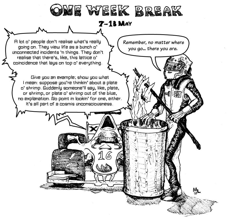
This is the second part of my journey to creating Corner the Maze.
I mentioned that my thumbnails were all over the place in Part I. This mostly didn't matter, aside from increasing my overall frustration with the process and slowing me down (not inconsequential over nearly six years), but did create several issues with paneling.
Paneling was not something I had ever seriously attempted before. At this point you might be wondering why, if the closest I had ever come to making a comic before was a three-page monstrosity soon abandoned when I was in my late teens, I had decided I could jump right into a multi-volume webcomic. The answer is that I didn't think about it, and I wanted to make something and get it out there, so I just put my head down and made a comic. Often messily.
My early paneling was highly formulaic. It tended towards two to three rectangular panels taking up either the top or bottom of the page, and the one remaining rectangular area being divided in two. Not interesting, and often not doing exactly what I wanted it to, either. Here's an example:
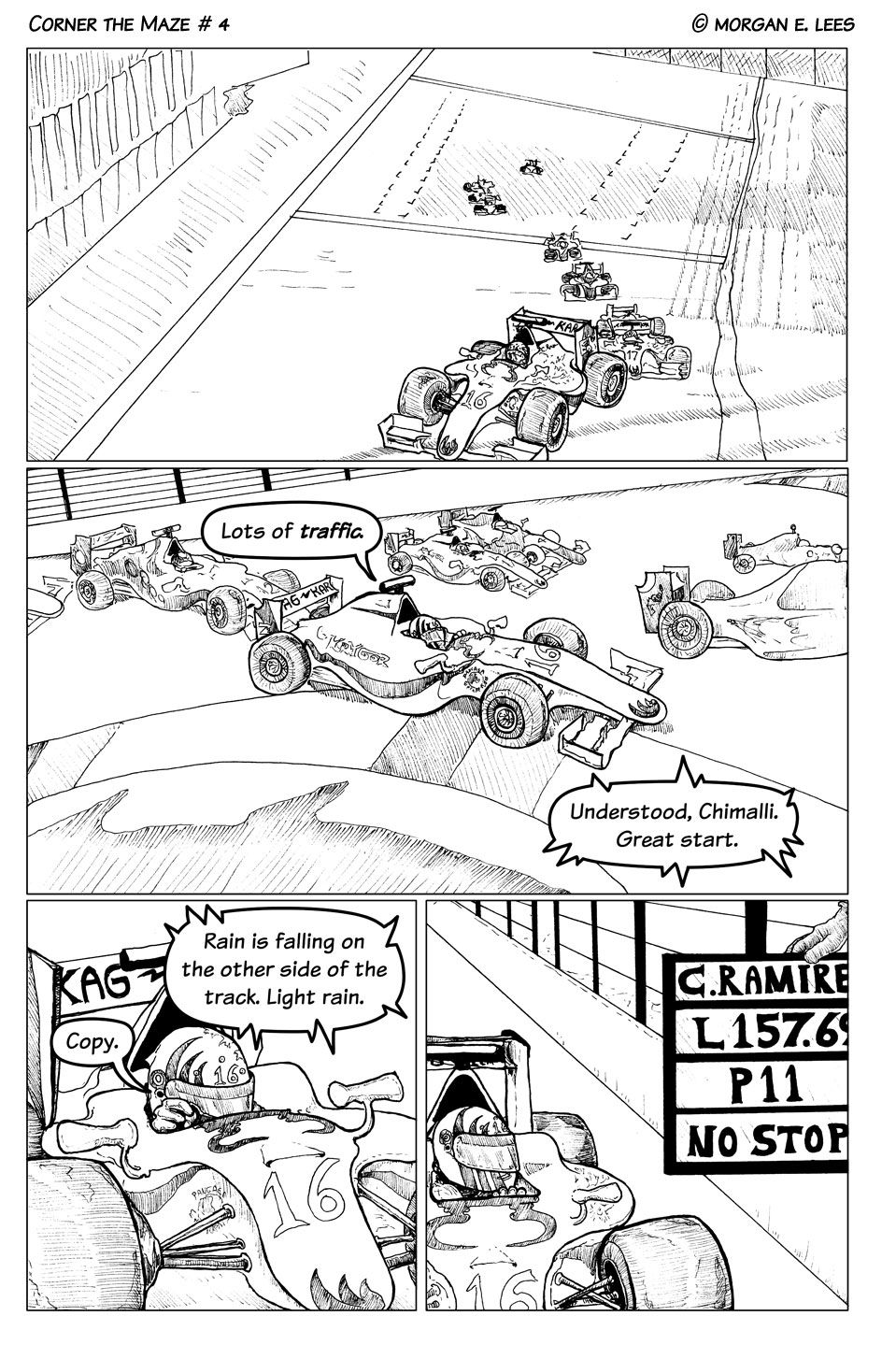
It mostly works in the above example, but nothing is emphasized, and it's not dynamic. I also hadn't worked out that differing line weights would have helped, which contributes to the general flatness of these early pages.
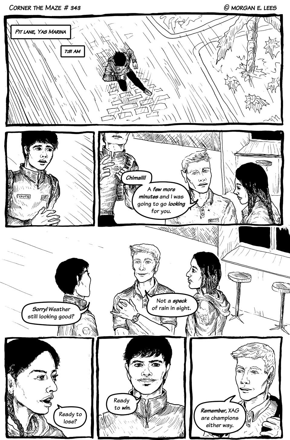
Contrast that with my most successful early page paneling here:
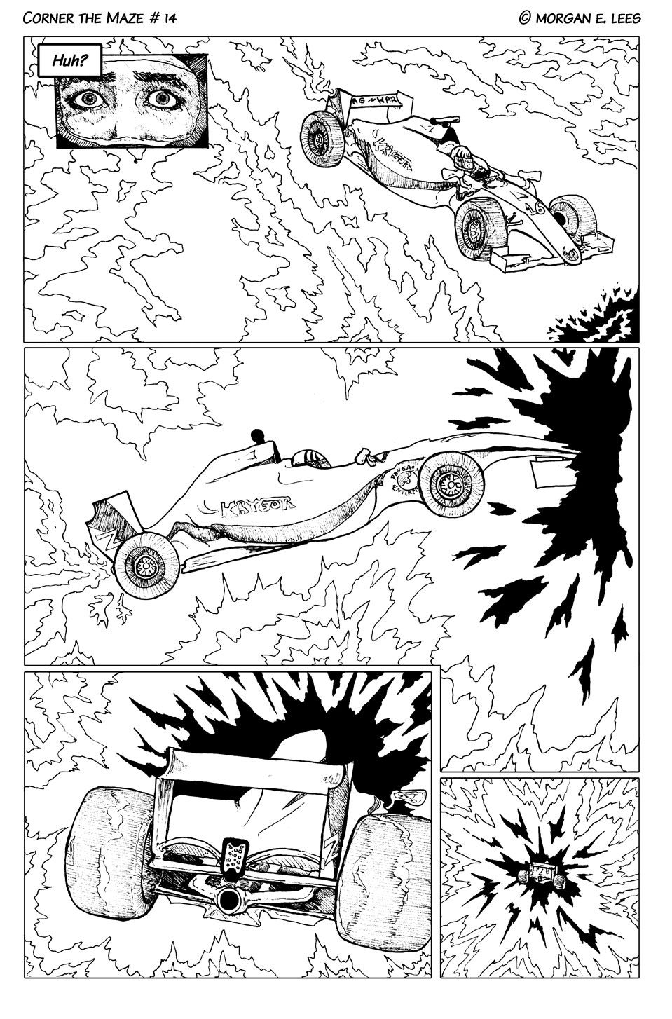
There's an inset panel in the top, the second panel isn't quite a rectangle, and the last two panels change in size to show the receeding car. I wish I could say that after this page my paneling improved, but it didn't, mostly; I stuck to the formula for much of Volume I.
This would be a good time to talk about lettering again. You see that nice, neat, readable font? Well, it wasn't original to that page. In fact, it wasn't until after several months of comic making it was pointed out to me how huge a problem legibility was for my comic that I changed the original font. Here's a comparison I put together at the time:
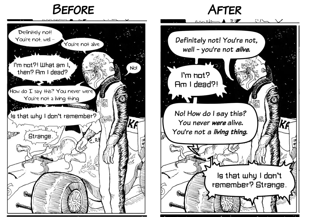
On the left, the old fonts; on the right, the new ones. I did keep the car's font the same, although I upped the size. I had found the previous font perfectly easy to read, although looking back on it, it is cramped and not the best fit for this application. But the new one, Komika, is much more readable and even.
You can tell that I also tweaked the speech bubbles and even the dialogue somewhat. I went back and did this for the first three chapters of the comic at the time, which was a lot of work, but I was happy to do it. After all, what good is a comic if nobody wants to read it?
Back to paneling. Here's a page from near the end of Volume II:
At this point I'd switched to a dip pen and ink from markers, and I was doing the panel borders by hand instead of adding them in Photoshop, but the paneling here is also much livelier. One of the big panels is borderless, and there are several smaller ones that have more of a purpose to them.
I'm still almost surprised that I made it through both volumes. Corner the Maze ran from August 2016 to early 2020, and I hadn't been intending to take such a longer break before starting work on my next comic project, but... well, everyone knows how 2020 went. And then 2021 was for me even worse.