Learning Comics the Hard Way, Part III: What I'll Do Differently Next Time
I did all right given how I jumped into comics. After all, Corner the Maze exists as a finished webcomic, it picked up a small but devoted group of readers, and I succeeded in telling the story that I wanted to tell. But there are some things that I will definitely do differently with my next comic.

This is the third part of my journey to creating Corner the Maze.
I did all right given how I jumped into comics. After all, Corner the Maze exists as a finished webcomic, it picked up a small but devoted group of readers, and I succeeded in telling the story that I wanted to tell. But there are some things that I will definitely do differently with my next comic.
Go Digital
I did the entirety of Corner the Maze traditionally, with pencil and then ink on comic board. I started out using markers for the line work and then switched to dip pens and ink because I hated how wasteful buying whole new markers when the ink ran out was, and just replenishing the pot of ink was so much better. It was the only way I was comfortable enough working to get a comic done, but I wasn't at all comfortable with color, so only the chapter pages were in color -- and only after I went back and redid them, at that.
Worse, it was slow. Going digital allows me to eliminate two whole steps of the process right away: erasing the pencil lines and scanning the pages. It also means that if my next comic should, say, feature a black sky with stars all the time, I could use a flood tool instead of brushing all that black ink on by hand and then waiting for it to dry. Perhaps the biggest improvement, I can place speech bubbles while I'm working on the lineart and avoid the awkwardness I ended up with a lot in Corner the Maze due to misestimating the size of speech bubbles.

Also, color! So really, for me, it's all positives, and I'm looking forward to it.
The Script
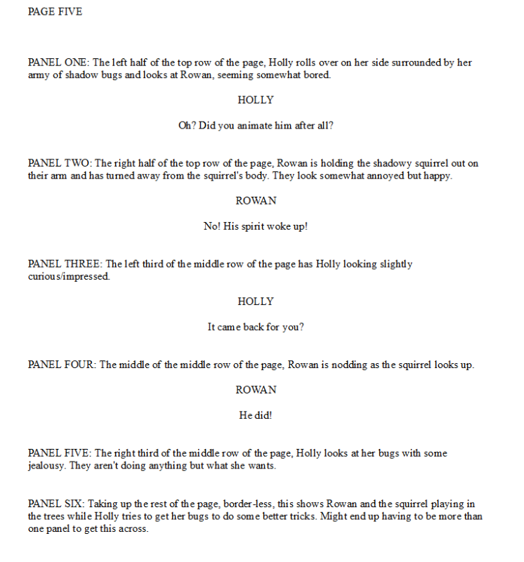
Neither approach that I used for Corner the Maze was satisfactory for me, but I think the biggest problem with the first approach was twofold; it took a lot more time on the writing end, and it was redundant with thumbnails. The second approach would never work without thumbnails.

Above is a page from a short comic in the works that will serve as a sort of long-ago prequel for my next project. It's back to panel by panel (why will become obvious with the next point), but the descriptions aren't as dense as I started out with. I'm trusting that I'll work out most of the visual details when I get to actually drawing. After this short story is finished, I'll refine my process for the larger comic to come.
Thumbnails
I'm not doing them again.
They're great for a lot of people's processes, and theoretically they're the stage to work out all the visual questions that weren't answered by the script and place the dialogue and everything... but that's never what my thumbnails ended up being for Corner the Maze. My handwritten dialogue didn't fit at all the shape that the computer lettering would (and I am not capable of hand lettering a comic; it would be illegible), and a lot of the ideas I thought I had worked out looked like scribbles when I came back months later to do the pencils.
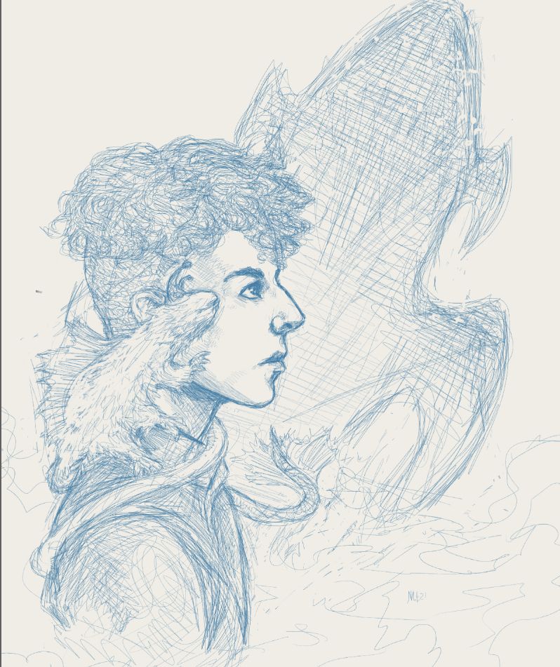
So I'm going to let the pencils do the heavy lifting. My pencils tend to be pretty tight, as shown in this sketch for a digital painting:

Since I'll be working digitally this time, I can do the pencils ahead of time and come back to them as I finish pages, so that part of the process will stay in place.
Streamline the Process
My process for Corner the Maze was set and reliable, but it had some serious slow points. First I would have the script, completed one volume at a time. After the script was complete, I did huge batches of thumbnails at a time (usually 2-3 chapters worth over a week). I had one day a week where I would pencil as many pages as I could get done, and one day a week where I inked and finished them (usually it was around 5-6 pages pencilled and 2-3 inked). Another day dealt with the marketing and business side of things. This did allow me to keep my twice per week schedule for the entire run of the comic, with a sizeable buffer, but at a cost; I look through my art folder and my writing folder and see that I accomplished basically nothing else for the entire run of the comic. Almost six years.
I'm unwilling to go back to doing nothing else while I'm working on my comic, so I intend to cut that work down to one day a week, possibly two. My plan is as follows:
- Have the entire script done beforehand, same as before.
- Pencil several chapters ahead in advance, and take a short break whenever I need to do this step again (ideally, I'll have a large enough buffer this will be invisible to readers).
- Start with the entire first chapter finished, and then finish one or two pages a week (however many I'll be posting or can finish in one day).
We'll see how it goes, but this should be a lot easier than before. I don't want to end up with a situation where I'm working on the comic multiple days a week from the time I get up until the time I go to bed, with just a break for food in between, which happened towards the end of Corner the Maze. It took me a year just to recover from that burnout.
Better Character Design Sheets
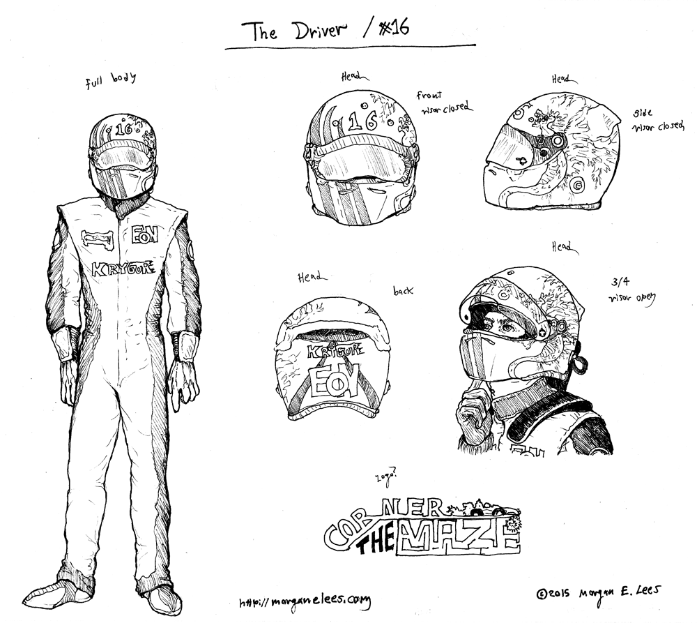
I had no idea how to do a character design sheet when I started Corner the Maze, but I knew that it would be useful to have one. So, I did them, and posted them up on the wall near I was working. This is the original sheet for Chimalli (still called "The Driver" because I hadn't settled on a name yet):

It kind of does what it needs to do. The fact that I only had him facing forward full body caused some issues, because I didn't consistently design the back of his suit exactly the same way when I had to draw it. Also, for some reason, I only did one side of the helmet when it should have been obvious we'd be seeing both sides of it at some point. And the biggest problem of all is that it doesn't even feature his face without the helmet on! When I did this sheet for some reason I thought he was going to keep his helmet on for the entire comic, but it quickly became clear that was silly... and that's why his appearance shifted a bit between the first time he took his helmet off and the next. This also features the old logo, which I liked the idea of but never got to work (it does do better at illustrating the intent behind the name).
This was the reference sheet for Chimalli in Volume II:

This time including his face! And other clothes than his race suit! I did learn from the first... although again I only did the race suit from the front, at least I had every side of the helmet. And I used color, because I knew I was doing the covers in color. But I still wasn't thoroughly thinking through everything I would need.
Here's a character sheet for a comic idea I had in 2020 but scrapped:

This one is trying to use the art style I was actually going to use for the comic, which is useful, and it does show the back of the character as well as a close-up and a side view. But it's not very detailed, and doesn't include their accessories or anything, so it still needs some work. For my next project I'm at least going to include front, back, and side in full body, face closeup, and detailed drawings of any accessories that the characters will use a lot.
I'll keep figuring things out as I go along, and I plan on doing a final entry in this series once I've launched my next comic. Stay tuned for that!

